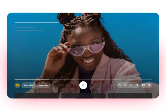
YouTube has rolled out a newly redesigned video player that delivers a cleaner, more immersive viewing experience across all platforms. After years of minor tweaks, this marks the most noticeable visual overhaul since the platform introduced dark mode in 2017.
The redesign quietly began rolling out worldwide this week, appearing first on Android and smart TVs before reaching desktop browsers. It touches nearly every part of the player interface, reflecting YouTube’s effort to refine the space where billions of users spend much of their screen time.
Table of Contents
What Makes the YouTube Video Player Cleaner and More Immersive?
The fresh design focuses on minimalism and usability, stripping away clutter while keeping essential controls within easy reach. It’s the latest step in Google’s broader visual refresh, aligning YouTube’s interface with the Material You design language, rounded shapes, softer edges, and fluid transitions that make interaction feel more natural.
A standout detail is the use of rounded, translucent on-screen buttons. The controls fade subtly into the video background without compromising visibility, offering a softer, more cinematic feel. The translucency is restrained, a sleek, glass-like finish that feels less glossy than Apple’s Liquid Glass aesthetic, balancing beauty with usability.
Check Out Our Article of YouTube Kills Trending Page—Replaces It with Category-Based Charts Published on July 11th, 2025 SquaredTech
It also brings consistency across platforms: whether you’re using YouTube on your smartphone, in a web browser, or through a smart TV, the interface now looks and feels unified. The seamless design reduces cognitive friction, so switching devices feels effortless and familiar.
Key New Features Enhancing Video Playback and Interaction
The new player isn’t just a visual refresh; it subtly reimagines how users interact with videos.
One major improvement is an upgraded “double-tap to skip” gesture. The feature lets users skip forward or backward by tapping either side of the screen, now with improved touch precision and smoother animations. It may seem minor, but for an app that serves billions of daily views, small interaction refinements like this can dramatically enhance comfort and reduce accidental taps.
Another change focuses on comment replies, a key part of YouTube’s community experience. Replies now open in a more focused, scrollable panel, especially on mobile, making long discussion threads easier to follow. This organization helps users engage with conversations without feeling lost in cluttered comment chains.
Additionally, YouTube has also added dynamic animations for the like button on certain video types. For example, liking a music video may trigger a brief animation with floating musical notes or thematic effects. These micro-interactions make engagement more satisfying, similar to the playful visual cues seen on TikTok or Instagram, reinforcing the sense of connection between viewers and creators.
Why This Update Matters for YouTube and Its Users
For a platform with over two billion active users, even subtle interface changes have massive ripple effects. YouTube’s new design reflects the industry’s broader move toward streamlined, less intrusive experiences, where content takes center stage and controls stay out of the way.
Simplifying buttons and reducing visual noise helps combat “interface fatigue,” making long watch sessions feel easier on the eyes and more immersive. This design philosophy also serves YouTube’s strategic goal: keeping viewers engaged longer without consciously realizing why.
The consistent interface across mobile, web, and TV brings a new level of familiarity. Viewers can seamlessly transition between devices, from their phones to a living room TV, without relearning navigation. It’s the kind of seamless continuity that strengthens user loyalty and keeps people within the YouTube ecosystem.
Beyond aesthetics, the refinements to skipping, comment threads, and button feedback all address long-standing user frustrations. The result is a smoother, more thoughtful experience that rewards active engagement rather than passive watching.
And while animations might seem like a fun flourish, they’re designed to encourage micro-engagement, the split-second feedback loops that make users more likely to interact, like, and stay longer.
Conclusion: Small Changes, Big Impact
At SquaredTech, we see YouTube’s new video player as a model of how mature platforms evolve, not by reinventing themselves, but by refining what already works. The update blends functionality with aesthetic restraint, acknowledging that a good design should disappear into the background of the content it serves.
YouTube’s refresh isn’t flashy, and that’s precisely why it succeeds. It’s the quiet kind of change that users notice without realizing it: videos feel a little sharper, the interface a little calmer, and the overall experience just better.
By making subtle, user-focused improvements instead of radical shifts, YouTube shows that the future of digital design isn’t about adding more; it’s about removing everything that gets in the way of watching what you love.
Stay Updated: Tech News


