

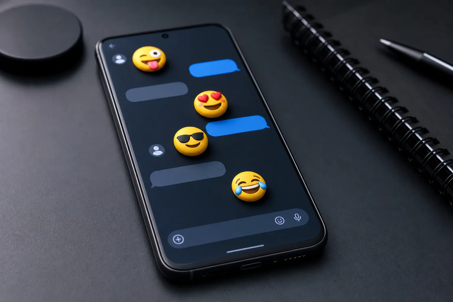
- Google’s Noto 3D emoji redesign covers all 3,977 characters and arrives on Pixel phones later this year.
- User research behind Noto 3D emoji found full-body animals improve recognition while extra props often reduce comprehension.
- Google built an AI-assisted contrast checker to help darker skin-tone emoji remain visible against dark-mode interfaces.
- The company will publish its complete emoji collection as open-source 3D OBJ models for developers and creators.
Table of Contents
Noto 3D emoji puts expression ahead of realism
Emoji are tiny, disposable bits of visual language right up until they aren’t. A misplaced wink can read as sarcasm; a hand gesture can turn a friendly note into a very awkward group-chat moment. That’s why Google’s Noto 3D emoji project is more consequential than its cheerful, squishy characters initially suggest. The company has rebuilt all 3,977 emoji in its set as three-dimensional illustrations, with a first rollout planned for Pixel phones later this year.
Google says its emoji style has long prioritized expression rather than photorealism, and that philosophy survives the jump into 3D. Frankly, it should. Nobody needs a biologically precise kangaroo peering out of a text message. Real kangaroos have a vaguely unsettling intensity when you look at them closely; the illustrated version is supposed to communicate ‘Australia’ or ‘hopping around,’ not make someone feel they’ve wandered into a wildlife documentary.
Google’s explanation keeps returning to the idea that these characters need a pulse and a soul, not the chilly exactness of an industrial CAD file. That’s a useful distinction. Google’s goal is simpler: preserve the visual shorthand that makes emoji work at the size of a fingernail, rather than turn every reaction into a miniature Pixar render.
Why Google tested the Noto 3D emoji so carefully
Moving a familiar visual system from flat art to dimensional models creates more opportunities for accidental meaning than most design refreshes. Google says it ran large-scale user studies to test whether changes to emoji might disrupt human connection. That wording sounds grand for a laughing face, but the premise is sound: emoji now function as punctuation across work chats, family threads, dating apps, customer support and public posts.
The findings were practical rather than flashy. Users strongly preferred animals with complete bodies over floating heads. Props, meanwhile, tended to hurt comprehension. And small changes could carry outsized consequences: changing the direction of a wink could shift a reaction from mild uncertainty to accidental offense.
That last detail gets at the hard part of emoji design. An emoji is not a sticker or a tiny piece of decoration. It’s closer to a traffic signal: people read it almost instantly, usually without conscious thought. When Google changes that visual grammar, it has to preserve recognition across cultures, screen sizes and contexts where users may only glance for a fraction of a second.
Google’s research also puts a little pressure on the broader industry. Apple, Samsung, Microsoft and others have each developed distinct emoji styles, which is part of the fun. But their work still sits on top of Unicode’s shared character standard. The Unicode Consortium determines which emoji concepts exist, while platform vendors decide their visual treatment. A single code point can therefore look playful on Android, glossy on iOS and oddly formal on a Windows device. That inconsistency isn’t going away, though the Noto 3D emoji update may give Android a clearer visual identity.
The strange engineering question: what is behind a smiley face?
There’s a delightful bit of design philosophy buried in Google’s explanation. Once an emoji becomes a 3D model, designers must decide what it is when it turns around. Is a smiley face a hollow, concave mask? A solid rubbery ball? Or simply a flat disc with a face painted on one side?
Those aren’t academic questions. A model’s form affects shadows, rotation, animation and how believable it feels when rendered in a modern interface. Yet Google has to solve them without adding visual clutter. My read is that this is where 3D can easily go wrong: depth is useful if it makes an object more readable, but it becomes noise if every surface gleams, reflects and competes for attention.
Google appears aware of that trap. The new characters begin as 2D sketches before being translated into 3D, which suggests the original silhouette and expression remain the source of truth. That’s the right workflow for Noto 3D emoji. Emoji must still read at small sizes, where subtle texture and sophisticated lighting mostly disappear anyway.
Building a proper model library has a practical upside, too. Google plans to release the full collection as open-source OBJ files. The company’s Noto project already has a long history of making type and language support broadly available, and open 3D assets could give developers, educators and creators a more consistent base for animations and interactive work. The licensing details will matter, of course, but the move is more useful than treating emoji artwork as an untouchable platform asset.
Dark mode exposed an emoji accessibility problem
Google also highlighted a less visible issue: Noto 3D emoji using the darkest skin tones can lose definition in dark mode. It says it created an AI-powered contrast tool that examines each character at the pixel level, flags weak contrast ratios and proposes higher-contrast alternatives for designers to implement.
This is one of those details that sounds small until you picture the actual user experience. If an emoji disappears into a dark chat background, the problem isn’t merely aesthetic. It means a person’s chosen representation is less legible than someone else’s. Google deserves credit for treating that as a design defect rather than shrugging and calling it a limitation of dark mode.
Still, AI deserves only a supporting role here. A tool can identify low contrast, but it can’t independently decide whether a revised shade preserves a character’s visual intent or cultural meaning. Human designers need to make that call, and Google says they are the ones applying the suggested fixes. That division of labor makes sense.
What the Noto 3D emoji rollout means for Android
The Noto 3D emoji set will debut on Pixel devices before expanding to Google’s other products. That sequence is familiar: Pixels have become Google’s public testing ground for Android’s visual ideas, from Material You to AI features that may or may not reach every phone maker at the same pace.
For ordinary users, the near-term impact may be modest. Messages sent from a Pixel will still map to the same Unicode emoji characters on other platforms, even if the recipient sees Apple’s or Samsung’s artwork instead. But Android users will get a more dimensional and internally consistent set, while the open models could encourage a wider ecosystem of compatible creative tools.
The bigger question is whether Google can keep the charm once these assets are everywhere. Emoji succeed because they’re immediate, a little silly and emotionally elastic. If the Noto 3D emoji update preserves that quality while improving legibility, it will be a rare visual overhaul people barely notice — which, for a language used by billions, is probably the best possible outcome.