

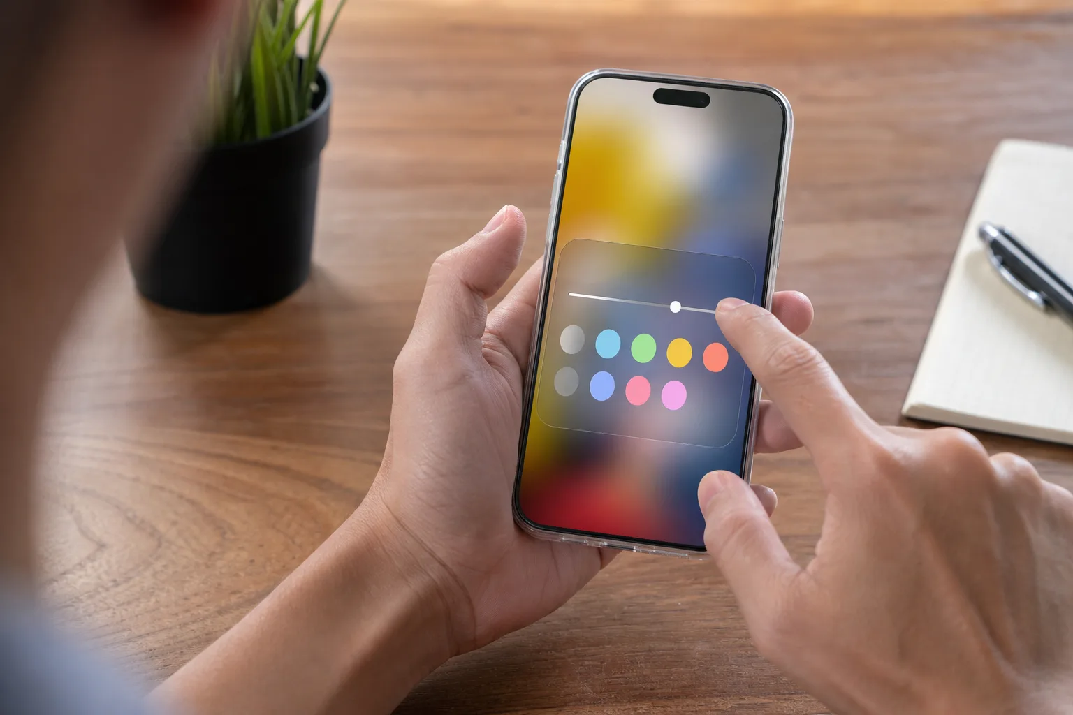
- Liquid Glass settings in iOS 27 replace rigid appearance choices with a slider for dialing opacity up or down.
- The new Liquid Glass settings preview changes immediately, making it easier to balance Apple’s visual style against everyday readability.
- Reduce Transparency remains the strongest option for people who want to strip back most translucent interface effects.
- iOS 27 reportedly supports iPhone 11 models and later, extending the appearance controls to older compatible phones.
Table of Contents
Liquid Glass settings finally offer a middle ground
Apple’s Liquid Glass settings have spent the last year exposing a familiar problem in interface design: a look can be striking in a keynote and irritating by Wednesday morning. The glossy, translucent visual treatment introduced across iOS has its fans. It can make an iPhone feel lighter and more layered, as though controls are floating above whatever sits beneath them. But when a translucent panel lands over a busy wallpaper or colorful app, the practical downside is obvious: text and icons can become harder to read.
With iOS 27, Apple appears to have accepted that two preset choices were never going to settle this argument. The company has replaced the earlier Clear and Tinted-style tradeoff with a continuous slider that lets people decide exactly how much visual glass they can tolerate. Frankly, it’s the sort of basic control that should have arrived when the design did.
That may sound minor. It isn’t. Interface preferences are intensely personal, particularly on a device people check dozens or hundreds of times a day. A setting that is slightly too transparent can feel like a smudge on a pair of glasses: manageable at first, then impossible to ignore.
How to change Liquid Glass settings in iOS 27
To adjust the new control, open Settings, select Appearance, and choose Liquid Glass. Instead of picking between fixed modes, iOS 27 presents a slider. Move it left for a clearer, more reflective interface. Move it right to make system surfaces more opaque and higher contrast. Leave it near the middle if you want Apple’s visual depth without committing to the full aquarium-wall effect.
Apple also includes a preview on the same screen. That sounds like a small usability detail, but it saves users from the tedious loop of changing a setting, backing out to an app, deciding it looks wrong, then returning to Settings. Anyone who has tuned a TV picture mode knows the routine. You need to see the result in context.
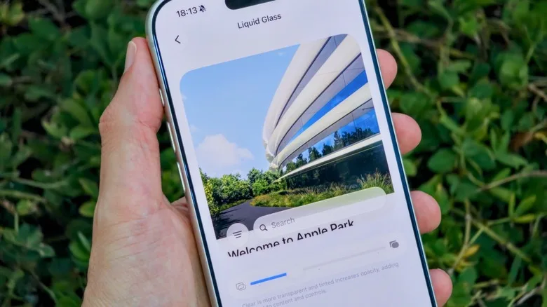
The revised Liquid Glass settings build on Tinted Mode, which Apple introduced after early complaints about readability. Tinted Mode reduced transparency and increased contrast, but it was still a blunt instrument: users essentially chose Apple’s preferred version of clear or Apple’s preferred version of tinted. A slider is a more honest answer. It admits that there is no universally correct opacity level.
Apple’s Display & Text Size accessibility documentation also offers useful context for why this matters. Contrast, transparency, motion, and text treatment are not decorative concerns for many users. They can determine whether an interface is comfortable to use at all, especially in bright sunlight, with visual impairments, or simply after a long day staring at screens.
Opacity is a design preference, but readability is an access issue
The debate around Apple’s translucent design has sometimes been dismissed as people objecting to change. That’s too glib. There is a real distinction between disliking a new aesthetic and struggling to parse controls because the background competes with the foreground. Apple’s early Liquid Glass settings tried to address both camps, yet the persistence of complaints suggests the presets did not go far enough.
Apple is hardly alone here. Microsoft has repeatedly adjusted transparency effects in Windows, while Google’s Material You design has moved between expressive color and stronger surface contrast depending on the release. The industry keeps learning the same lesson: when software tries to look like physical material, it still has to behave like a tool. A frosted pane can be pretty. A button must still look like a button.
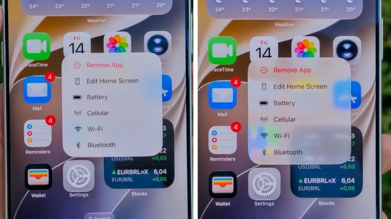
My read is that iOS 27’s slider is Apple doing something it has historically resisted: handing over a bit more aesthetic authority. Apple tends to prefer tightly managed defaults because consistent design is part of the company’s product identity. Yet an iPhone is not a showroom object. It is also a navigation device, a banking terminal, a work screen, and, for plenty of people, the way they read messages without reaching for glasses.
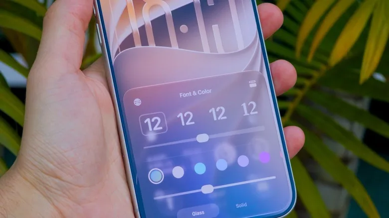
The company reportedly keeps the Lock Screen control separate. That makes sense. Lock Screens are often more expressive and wallpaper-driven, while system menus need to get out of the way. If you want the shimmer on the Lock Screen but a denser, calmer interface everywhere else, iOS 27 can accommodate that split.
Reduce Transparency is still the escape hatch
For users who find even the maximum slider position too glassy, Liquid Glass settings are not the end of the road. Go to Settings > Accessibility > Display & Text Size and enable Reduce Transparency. This is the heavy-duty option. It substantially cuts back translucent effects across iOS and favors solid backgrounds and stronger separation between elements.
That toggle is likely the better choice for someone who values clarity above all else. It may make the interface feel less airy or less aligned with Apple’s latest visual direction, but that is precisely why accessibility controls exist. Nobody should have to accept reduced legibility to preserve a designer’s intended atmosphere.
The catch is simple: these Liquid Glass settings require iOS 27. The update is said to support iPhone 11 models and newer, so the feature should reach a meaningful slice of Apple’s installed base rather than being reserved for the latest hardware. Before installing any major update, back up the phone and consider waiting for early bug reports if it is central to work or travel. Betas are tempting, right up until an app you need refuses to cooperate.
A small slider that says something bigger about iOS
Apple will still ship its preferred look as the default, and it should. Design leadership means making a call. But the new Liquid Glass settings recognize that preference is not failure, nor is accessibility a concession. It is part of good product design.
If Apple keeps this approach, the bigger question is where it goes next. Could iOS offer separate transparency controls for notifications, widgets, and app chrome? That might be overkill. Then again, people once thought a system-wide text-size control was overkill too. The best software defaults are confident; the best settings know when to let people take the wheel.
Frequently Asked Questions
Where can I find Liquid Glass settings on an iPhone?
On an iPhone running iOS 27, open Settings, choose Appearance, then select Liquid Glass. Apple places the main intensity slider there, alongside a live preview, so users can judge the effect before leaving the settings screen.
Does Reduce Transparency turn off Liquid Glass completely?
Reduce Transparency can disable Liquid Glass almost completely and is more aggressive than the Liquid Glass slider. Find it under Accessibility, then Display & Text Size.
Can the iPhone Lock Screen glass effect be changed separately?
Yes. The Lock Screen’s glass-effect adjustment remains separate from the system-wide Liquid Glass slider in Settings.