

- The Apple Music redesign in iOS 27.2 beta 4 swaps the familiar red icon for an austere black-and-white alternative.
- Apple Music redesign changes also turn the active tab blue and drain color from Library categories and widgets.
- The visual shift follows Apple’s newer Music logo, pointing to a broader brand cleanup rather than a one-off beta experiment.
- Apple still has time to change the design before iOS 27.2 ships publicly, and beta feedback could still sway the decision.
Table of Contents
Apple Music redesign trades personality for polish
Apple has spent years teaching us that Music means red: red gradients, red widgets, red navigation accents, red everywhere. The Apple Music redesign now appearing in iOS 27.2 beta 4 takes a sharp turn away from that visual inheritance. The app icon is white with a black musical note in the standard appearance, then black with a white note in Dark Mode. It’s clean, restrained, and frankly a little startling.
That new icon joins a recently introduced Apple Music logo that has begun turning up across Apple’s software and marketing. Seen alone, an icon swap might be the sort of beta detail most people never notice. But iOS 27.2 changes the app itself in ways that make the direction hard to miss: Apple appears to be putting Music through the same minimalist filter that has touched much of its current design language.
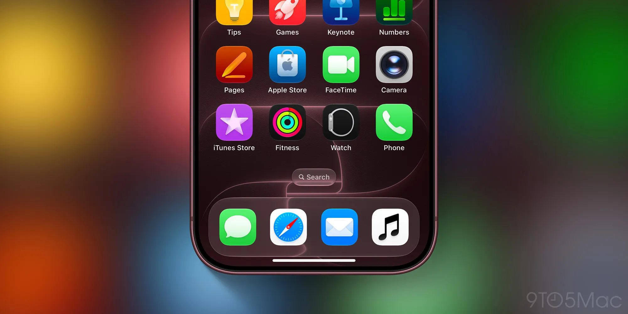
The immediate question is whether this is an improvement. My read: Apple has made the icon more flexible and less dated, but it has also made one of its most recognizable apps look alarmingly generic. Put a black note on a white rounded square next to a dozen other monochrome icons and it starts to feel less like a music service with its own identity than a placeholder that escaped a design review.
That may be intentional. Apple has increasingly favored interfaces that recede into the device rather than demand attention. The company’s Apple Music page still sells the service with artist photography, colorful album art, and the obvious emotional pull of music itself. The software shell, by contrast, is being asked to stay quiet.
What iOS 27.2 changes inside the Music app
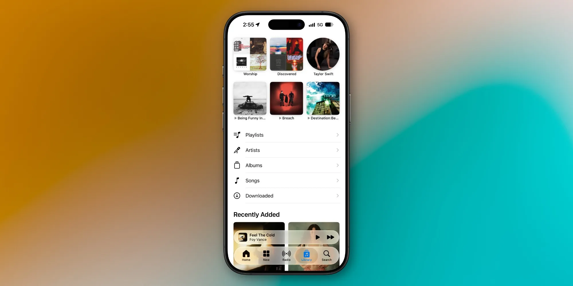
The Apple Music redesign extends past the Home Screen. In the current iOS 27.2 developer beta, the selected item in Music’s tab bar uses blue rather than the pinkish-red accent that long defined the app. The Library also loses color in its category list, leaving Playlists, Albums, Artists, and Songs in a black-and-white treatment.
Widgets are getting the same memo. Where Apple Music widgets once used red or pink backgrounds that made them easy to spot at a glance, the revised versions favor black backgrounds. Album artwork still supplies plenty of color, obviously, but Apple is separating the content from the application chrome more aggressively than before.
There’s a practical argument for that approach. Album covers are wildly different in style and brightness; a neutral frame avoids a fight between Apple’s UI colors and an artist’s visual identity. Blue is also Apple’s default language for an active control, so the changed tab bar may feel more immediately familiar to iPhone users. The old red was branding first. The new blue is interface convention first.
Still, conventions can become camouflage. Spotify’s green is not subtle, YouTube Music leans into red, and even Tidal’s black-and-white identity has a distinctive sense of luxury around it. Apple Music has historically occupied an unusual middle ground: more polished than Spotify, more colorful than a typical Apple utility. This Apple Music redesign risks sanding down that difference.
A brand refresh, not a feature update
Nothing in these changes makes Apple Music better at the essential job: helping people find, organize, and play music. There are no new listening modes, no promised audio-quality gains, and no answer here to the complaint that streaming libraries can become an unmanageable attic of saved tracks. This is brand work.
Brand work matters, though. An app icon is the front door users see dozens of times a week, and a visual system establishes whether an app feels coherent across an iPhone, iPad, Mac, web browser, and the increasingly crowded world of in-car displays. Apple’s move toward a simplified logo and monochrome surfaces could make the Apple Music redesign easier to carry across all of those places.
It also fits Apple’s broader habit of periodically resetting a product’s visual vocabulary. The company did it with iOS 7’s move away from skeuomorphism, and later softened some of that era’s extremes after people complained about flatness and legibility. Remember the initial reaction to Apple’s ultra-thin fonts? Design taste can turn on a dime when people have to use it rather than stare at screenshots.
The beta may not be the final word
iOS 27.2 beta 4 is developer software, not a shipping release, and that distinction matters. Apple can still revise the icon, colors, or widget treatment before the update reaches the public. Beta builds frequently expose work in progress, and Apple has changed course on visual details after testing them with developers and public beta users.
Early reactions are likely to split for a simple reason: the old Apple Music look had a point of view. Its red accents were not universally loved, but they were unmistakable. The Apple Music redesign looks better suited to a tidy Home Screen full of carefully matched icons; it looks worse if you want your music app to signal some actual enthusiasm for music.
There’s also a small but real usability concern. Color is not decoration alone. It helps people build muscle memory and identify states quickly, especially across widgets and dense menus. Apple’s new blue selection state is conventional enough, but stripping color out of the Library could make an already text-heavy area feel flatter. Accessibility isn’t automatically harmed by monochrome design, yet reduced visual differentiation can make software feel slower to parse.
Apple is betting the music will supply the color
The charitable reading is that Apple knows the interface shouldn’t compete with album art, artist images, and now-playing visuals. The harsher reading is that the company has mistaken minimalism for neutrality and neutrality for taste. Both can be true depending on the screen.
If the Apple Music redesign ships substantially as it appears today, subscribers probably won’t cancel over an icon. At $11.99 per month, Apple Music competes on catalog depth, audio features, device integration, and increasingly on how well it can surface something worth hearing before you give up and play the same three albums again. A black note cannot solve those problems.
But it can tell us what Apple thinks its service should be: less a colorful destination, more a calm system component. We’ll see whether that makes Apple Music feel timeless or merely anonymous. For a company that once made the iPod silhouette an icon of pop culture, anonymous would be a strange note to end on.