

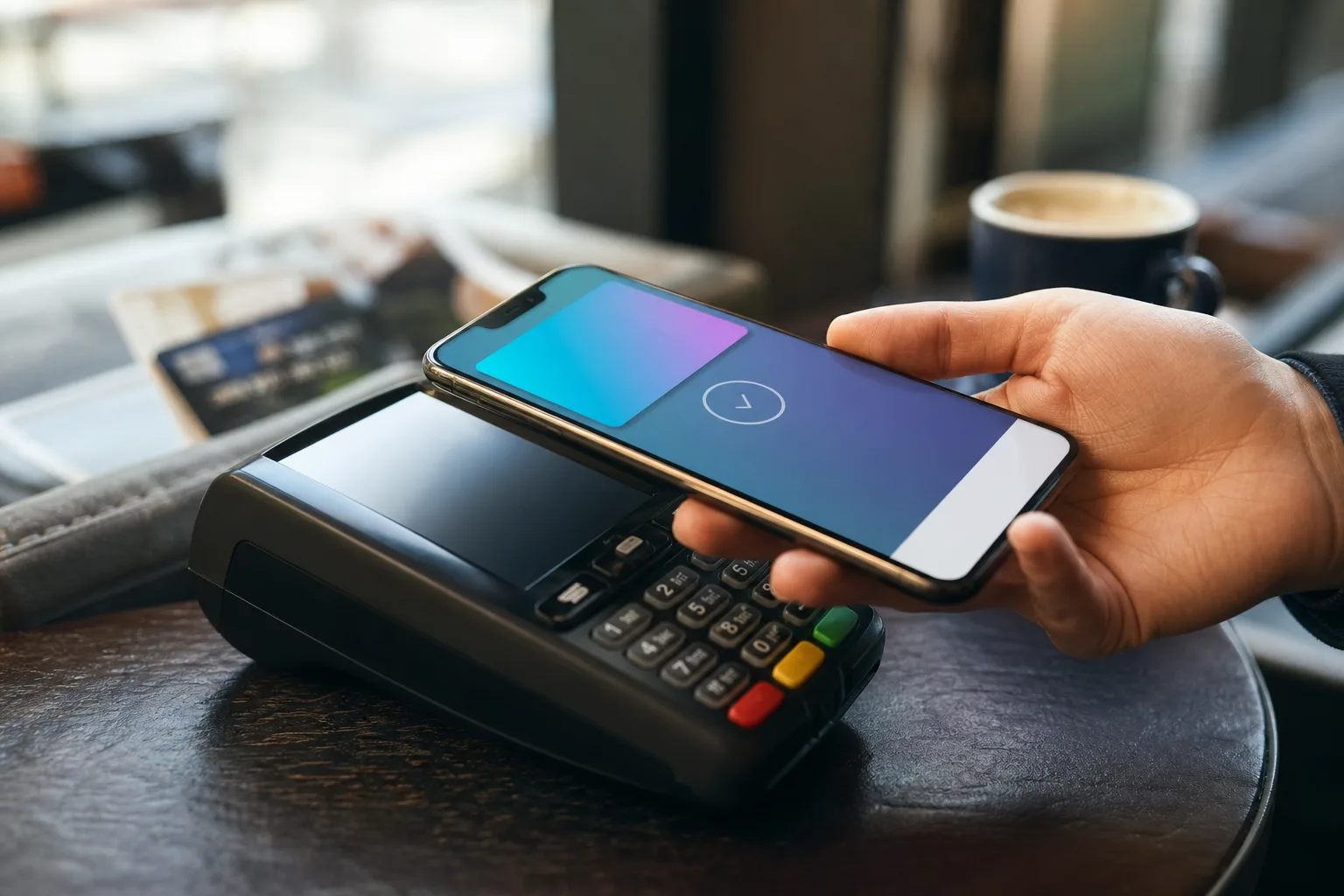
- Apple Pay checkout in iOS 27 lets iPhone users swipe directly between cards instead of hunting for a separate control.
- The redesigned Apple Pay checkout can show rewards, balances, debit account details, and pay-later choices before a purchase is approved.
- Apple’s old payment sheet confused users because tapping a card often opened delivery-address settings rather than card selection.
- Merchants retain control over which order and payment details appear in the checkout sheet, limiting unwanted clutter.
Table of Contents
Apple Pay checkout finally follows the obvious gesture
The old Apple Pay checkout flow had an oddly familiar Apple problem: it looked clean right up until you tried to do something slightly outside the default path. Want to change the card you’re using? Your instinct was to tap the card. On iOS 26, that could send you into address settings instead, while the actual card-switching control sat elsewhere on the sheet. It was a tiny bit of friction, but payments are exactly where tiny bits of friction become irritating fast.
With iOS 27, Apple is fixing that awkward moment. Users will be able to swipe through their eligible payment cards directly from the main sheet, or tap a card to open a grid view of every available option in Apple Wallet. That sounds almost comically basic, and frankly, it is. But basic is the point. A wallet should work like a wallet: look at what’s inside, pick the card you want, and pay.
The revised Apple Pay checkout experience applies when people pay inside apps and on the web from an iPhone. Apple says the layout will also bring useful card information into view, including available rewards, balances, debit-account balances, and pay-later options. The company’s stated aim is to help customers make “more informed payment decisions” before confirming a purchase.
That language is corporate, naturally. Still, the underlying idea is sensible. The card that gives the best airline points may not be the one that has the best immediate cash-back offer; a debit card may have a lower available balance than a credit card; a buy-now-pay-later option might be useful for a larger purchase, or a terrible idea for a pair of headphones you didn’t need in the first place. Putting the relevant information closer to the decision is a genuine usability improvement.
Why the Apple Pay checkout redesign matters
Apple Pay has succeeded partly because it strips away ceremony. You authenticate, choose a card if necessary, and move on. There are no card numbers to type, no expiry fields, no attempt to remember whether the billing ZIP code is your current one or the address from three apartments ago. Apple Pay is designed for payments.
But streamlined doesn’t mean opaque. As digital wallets accumulate cards, installments, loyalty-linked offers, and bank-specific perks, the payment screen can’t pretend every funding source is interchangeable. For plenty of people, the choice matters. A family budgeting through a debit account, a frequent traveler chasing points, or anyone attempting to avoid revolving credit has a reason to pause before they authorize a transaction.
The new Apple Pay checkout design appears to acknowledge that reality without turning the payment sheet into a miniature banking dashboard. Swiping between cards is fast. Opening a grid when you need the full picture is familiar iPhone behavior. It’s the sort of interaction model that makes you wonder why the previous version took a detour through an unrelated settings screen.
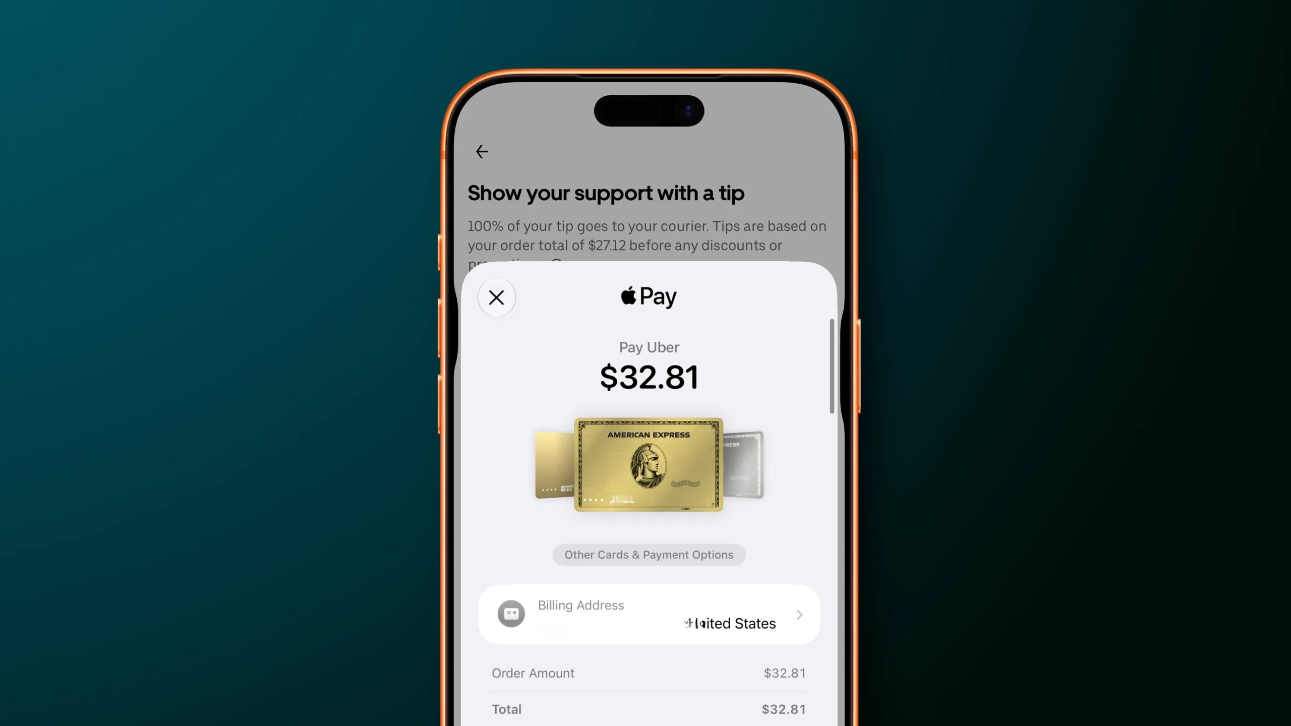
Apple is also giving merchants and developers control over the information presented in the payment sheet, depending on what is needed to complete an order. That’s a practical constraint, not a minor footnote. An online grocery order may need substitution and delivery information; a ticketing app may need a phone number or attendee details; a quick in-app purchase should not ask for anything beyond payment authentication. The best Apple Pay checkout is one that tells you enough to feel confident, then gets out of your way.
More payment context can help — if Apple keeps it restrained
The most interesting part of the iOS 27 change isn’t the swipe gesture. It’s Apple’s decision to surface financial context at the point of sale. Rewards and balances can help people choose well, but they can also become an invitation for issuers and installment providers to compete for attention in the one place users are trying to finish quickly.
We’ve seen this movie before. Credit-card apps increasingly promote offers, merchant discounts, installment plans, and upgrades in every spare corner. Buy-now-pay-later providers have made the checkout page their natural habitat, often presenting a lower monthly number more prominently than the total cost. Apple has generally been better than most at keeping its interfaces calm. My read is that this redesign works only if the company preserves that discipline.
There is a meaningful difference between showing that a card has a relevant reward and flashing a parade of financing prompts. The former gives the user information. The latter turns a trusted payment layer into advertising inventory. Apple’s description suggests the company understands the distinction, but the real test will be what banks, card networks, and pay-later partners are permitted to place on the sheet over time.
A small fix with an outsized effect
There’s no flashy new hardware feature here, no dramatic promise about artificial intelligence, and no reason most users will update because of this alone. Yet Apple Pay checkout is one of those surfaces people encounter when they’re trying to buy groceries, reserve a hotel room, or replace the charger they left in a hotel room. It needs to be boring in the best possible way.
iOS 27’s changes correct a basic mismatch between what users expect a payment interface to do and what the previous design actually did. Tap to see options. Swipe to move between them. See the financial details that could affect the choice. Confirm. Done.
Apple still has to prove it can show more useful payment data without making the sheet feel like a coupon circular. If it gets that balance right, this Apple Pay checkout update may be remembered as the kind of design correction users barely notice — because it finally behaves exactly as they expected all along.