

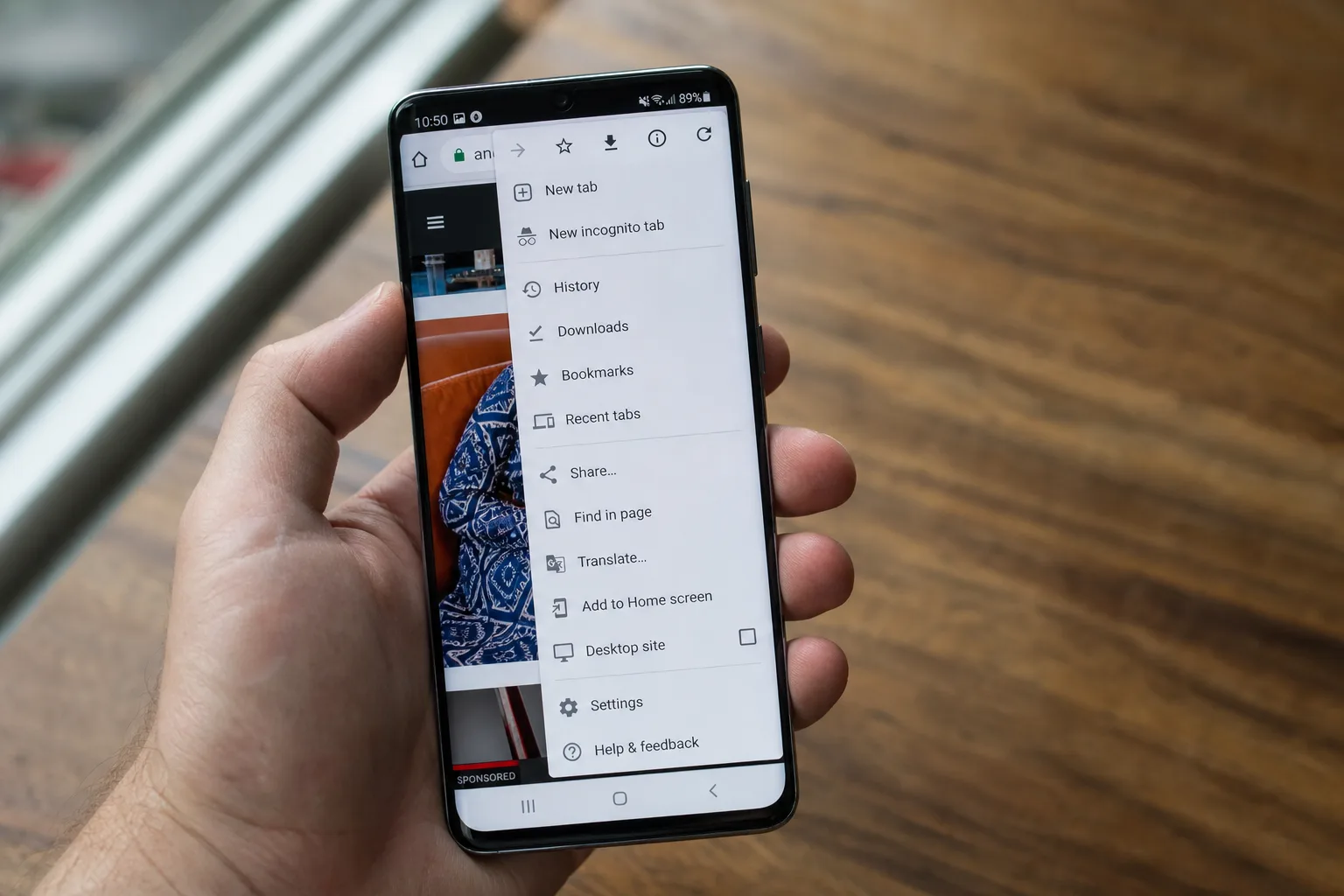
Google has quietly shipped one of those small-but-noticeable browser updates that changes how millions of people interact with their phone every day. Chrome 150 Android is now rolling out broadly through the Play Store, and the headlining change is something iOS users have been enjoying for a while: a proper dedicated back button sitting right inside the three-dot overflow menu.
- Chrome 150 Android finally adds a dedicated back button to the three-dot overflow menu, matching a feature iOS users have had for a while.
- Chrome 150 Android removes the standalone info button, replacing it with a new ‘Site controls’ entry deeper in the overflow list.
- The Bookmark star and Download button shift position in this update, breaking the muscle memory of long-time Chrome users.
- A small but notable label change renames ‘Add to Home screen’ to ‘Install and create shortcut’ in the same release.
Table of Contents
What Chrome 150 Android Actually Changes in the Menu
Until now, cracking open Chrome’s overflow menu on Android gave you a forward button at the top — but no back. If you wanted to go back a page, you were relying on Android’s system-level back gesture or the navigation button. That’s fine for most people, but it’s always felt slightly inconsistent, especially for users migrating from iOS or anyone who prefers to keep all their navigation controls inside the browser itself.
Chrome 150 Android fixes that by placing a back button alongside the existing forward button in the top row of the overflow panel. It’s a small addition, but one that rounds out what should have been there from the start. On the desktop version of Chrome, you can already customise this further — heading to Customize Chrome from the New Tab Page, then Toolbar, then Navigation lets you toggle the forward button off entirely if you want a cleaner look.
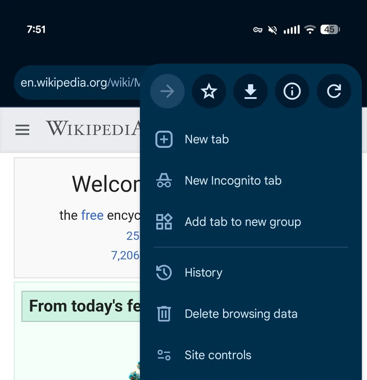
The back button isn’t the only tweak shipped in this update, though. Google has also removed the standalone info button — that small ‘i’ icon that showed you certificate and site data details — and replaced it with a new ‘Site controls’ entry in the overflow list. It’s a more descriptive label that arguably communicates its purpose better to casual users, even if power users who muscle-memoried the old location will need a moment to re-orient themselves.
The Muscle Memory Problem No One Talks About
Here’s the thing about UI changes that seem minor on paper: they carry a real cost for people who use an app dozens of times a day. The removal of the info button and the arrival of Site controls has a knock-on effect — the Bookmark star and Download button both shift to the right in the menu. If your thumb has been trained over months (or years) to tap in a specific spot to bookmark a page, that shift is genuinely disruptive, even if it only takes a day or two to re-learn.
Google isn’t the only company that routinely underestimates this. Nielsen Norman Group’s research on browser interface consistency has long highlighted that frequent users of an interface build strong spatial memory — and disrupting that, even for a logical improvement, creates short-term friction. Chrome has been reshuffling its overflow menu with increasing regularity. The last notable addition before this one was ‘Show Reading mode’, which landed in February. The menu is getting busier, and at some point Google may need to think harder about grouping or collapsing items rather than just appending new ones.
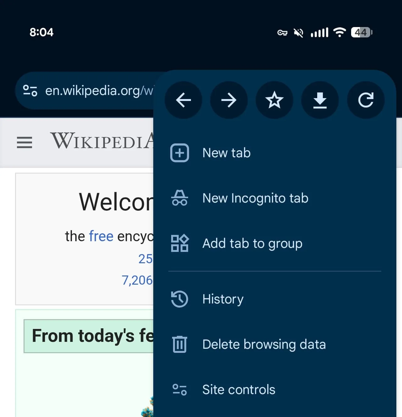
Chrome 150 Android Catches Up With iOS — Finally
The parity angle here is worth dwelling on. Chrome for iOS has carried an in-menu back button for some time, which made Chrome 150 Android feel like a long-overdue catch-up rather than a bold new feature. This kind of cross-platform lag isn’t unusual — Apple’s tighter control over iOS UI conventions often pushes developers to implement certain navigation patterns on that platform first — but it does highlight how fragmented the Chrome experience can be across operating systems even within Google’s own ecosystem.
Android users who also use Chrome on desktop will know this feeling well. Feature rollouts between Chrome desktop, Chrome Android, and Chrome iOS follow no obvious schedule, and things like Reading Mode, side panels, and now the back button have arrived at wildly different times on each platform. Google hasn’t publicly explained why the Android version lagged here, but the consistency improvement is welcome regardless.
The ‘Install and Create Shortcut’ Rename — Small Change, Bigger Signal
Buried further down in the Chrome 150 Android changelog is a label rename that’s easy to miss but signals something about how Google thinks about Progressive Web Apps. ‘Add to Home screen’ has become ‘Install and create shortcut’. On the surface, it’s just a string change. But the new wording leans into the concept of installation rather than a shortcut, which aligns with Google’s broader push to have PWAs treated more like native apps on Android.
For developers building PWAs, this kind of language shift matters. It shapes user perception — ‘install’ implies a more permanent, app-like commitment than ‘add a shortcut,’ and that could nudge more users to actually try web apps they’d otherwise ignore. Google has been investing heavily in PWA infrastructure across Chrome and Android for years, and this tiny copy change feels like part of that longer arc.
What’s Coming Next for Chrome on Android
Chrome 150 Android lands at an interesting moment for the browser more broadly. Google recently confirmed that older Manifest V2 extensions will be removed from Chrome desktop in August 2026 — a long-running transition that’s caused significant friction with extension developers and ad-blocking communities. On the AI side, Gemini integration inside Chrome has been expanding, with a ‘Select from screen’ tool now available in some markets. Chrome Autofill is also gaining deeper Google Wallet integration, making the browser an increasingly central part of Google’s payments infrastructure.
The Chrome 150 Android update won’t make headlines the way a Gemini feature would, but these incremental UI improvements are what most people actually experience every day. Getting navigation right inside the overflow menu, syncing feature parity with iOS, and cleaning up menu labels might not trend on social media — but they’re exactly the kind of polish that determines whether a browser feels trustworthy and well-maintained or slightly neglected. Right now, Chrome on Android is clearly getting attention. Whether Google can keep the overflow menu from becoming an unnavigable sprawl over the next few releases is the real question worth watching.