

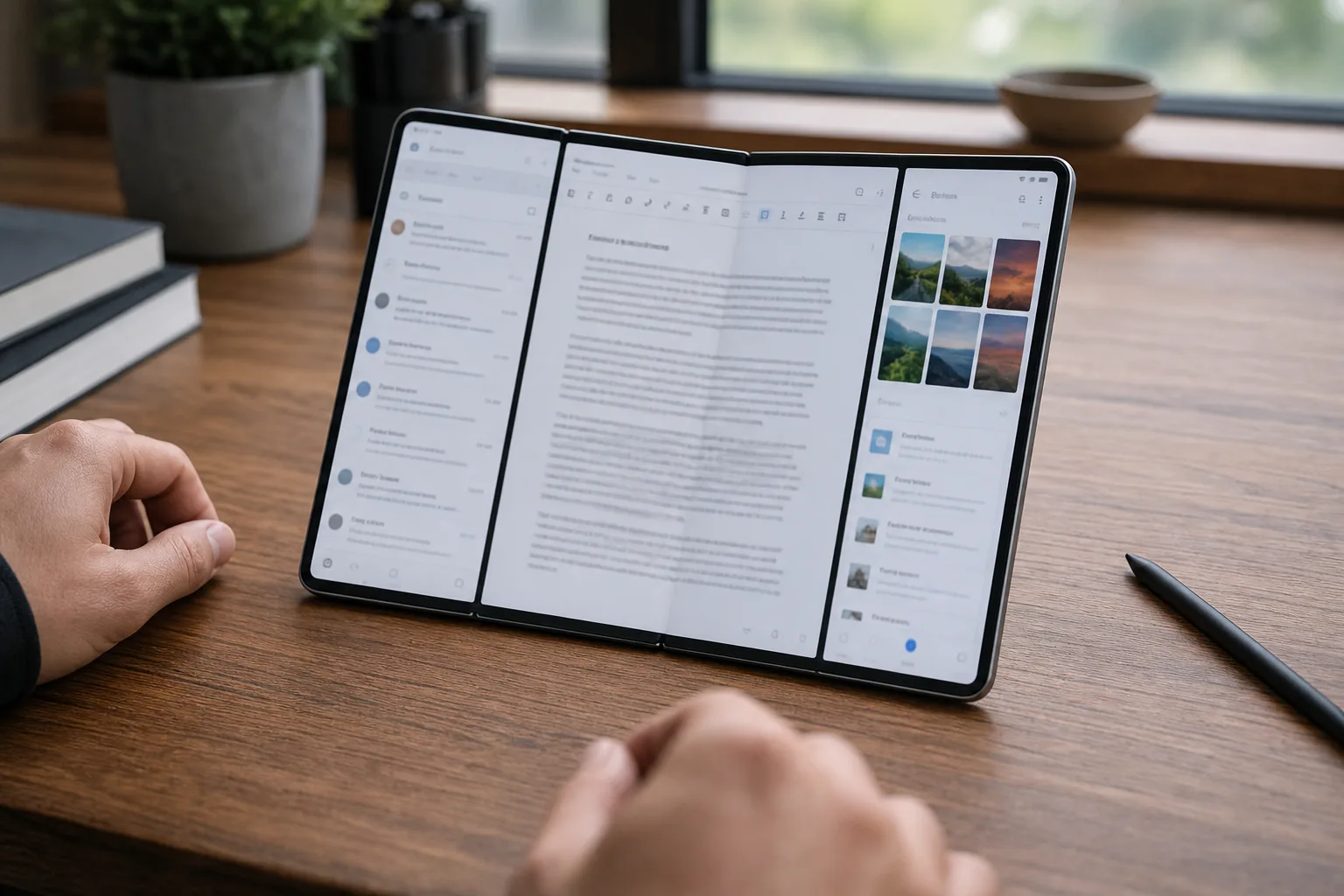
- Galaxy Z Fold 8 introduces a 90:10 three-app split that gives two secondary apps narrow but usable panes beside a main window.
- The Galaxy Z Fold 8 appears to support three full-height vertical app columns, while the narrower Ultra model reportedly uses a stacked alternative.
- Samsung’s One UI 9 documentation confirms new two-way and three-way split views but leaves the model-specific layout differences unexplained.
- The change matters because foldables need better workflow software, not merely thinner frames and larger specifications sheets.
Table of Contents
Galaxy Z Fold 8 turns display width into useful workspace
A foldable phone earns its price when it lets you do something a normal slab phone can’t. The Galaxy Z Fold 8 may finally have a stronger answer to that question: a new three-app multitasking arrangement in One UI 9 that puts one primary app beside two skinny secondary windows. It sounds like a minor software tweak. Frankly, it could be more useful than another round of thinness claims on a launch stage.
Samsung’s layout uses a 90:10 split, borrowing the core idea behind the Open Canvas interface on OnePlus and OPPO foldables. Rather than cutting the inner screen into three equally cramped columns, Samsung gives the main app most of the real estate and reserves narrow vertical strips for two supporting apps. Think a browser or document in the center, with a chat thread and a music queue, calendar, calculator, or notes app within reach.
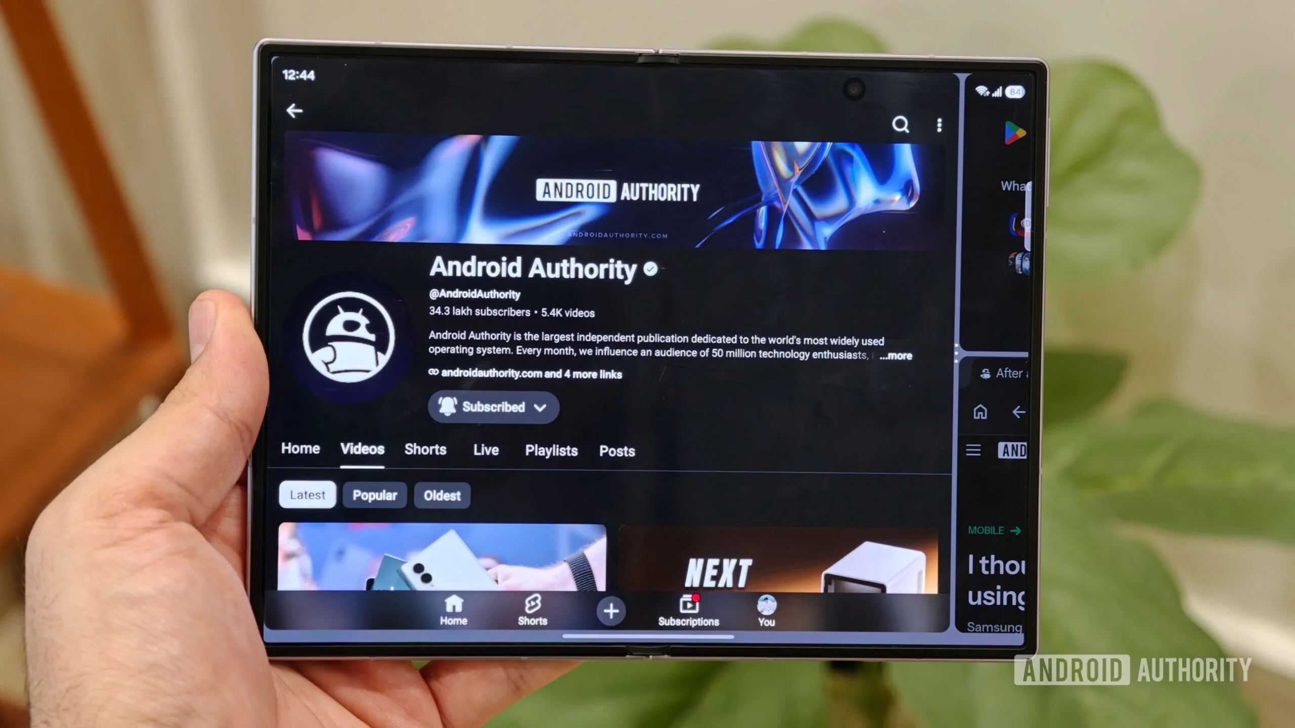
That’s the practical appeal. Equal three-way splits look impressive in a demo, but three fully featured apps rarely deserve equal space. A reference app needs to be visible; it doesn’t need to become the star of the show. The 90:10 approach treats those side panes more like the tool tray on a desktop than independent windows, and that’s a better use of a phone-sized workspace.
Reports from users and hands-on testing indicate the standard Galaxy Z Fold 8 can also place three apps in full-height vertical columns. Samsung has not made this feature a headline attraction at its Unpacked presentation, where Galaxy AI features, batteries, and hardware design got the bulk of the attention. But power users notice the small things. They’re the people who bought a folding phone because they were tired of pretending a regular phone was adequate for managing a busy workday.
Galaxy Z Fold 8 and Ultra may not multitask the same way
The catch is that the two models reportedly handle the third app differently. The Galaxy Z Fold 8 Ultra reportedly supports a three-app configuration with one large app on one side and two smaller apps stacked on the other, but not the regular Fold 8’s three side-by-side vertical windows. That may sound backward given the Ultra label, yet the explanation is fairly mundane: usable width matters more than branding.
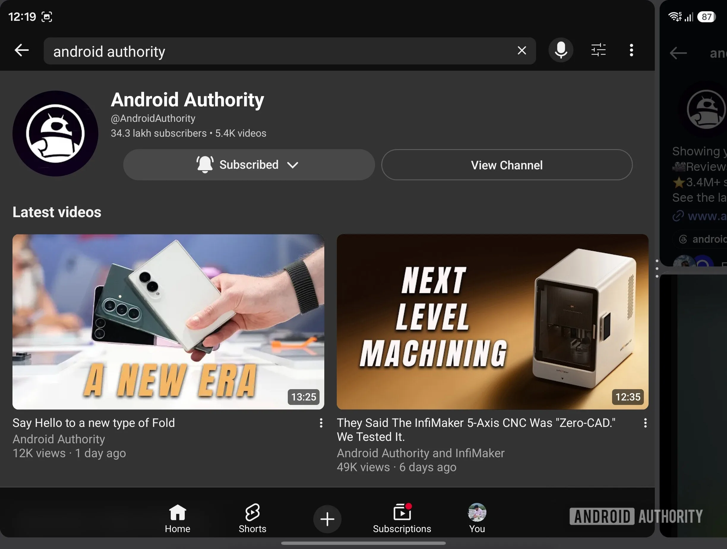
If the Ultra’s unfolded panel is narrower, forcing three vertical app windows onto it could create a layout that technically works but feels miserable. Buttons shrink, text wraps into tall columns, and an app that was designed for a conventional phone suddenly behaves like it has been squeezed through a mail slot. Samsung may have decided the stacked layout is the less compromised option.
Still, Samsung should explain the distinction instead of leaving buyers to discover it through Reddit threads and trial-and-error. On its official One UI page, Samsung says the Fold 8 Ultra supports two-way and three-way split views, with users able to switch between apps freely. What it doesn’t spell out is which three-way arrangements are available on which model. For a flagship family priced around productivity ambitions, that is the kind of detail shoppers deserve before checkout.
The Galaxy Z Fold 8 has room to make those three columns plausible, but raw panel dimensions are only part of the story. App behavior will decide whether the feature sticks. Android’s large-screen ecosystem has improved dramatically since Google started pushing tablet and foldable optimization, yet some apps still handle resizing with all the grace of a desktop website from 2008. Samsung can provide the canvas; developers still have to paint on it.
Samsung is catching up to an idea rivals got right
OnePlus made Open Canvas one of the more convincing arguments for its Open and Open 2 foldables. OPPO’s implementation, built from the same family of ideas, recognized something Samsung’s earlier Fold software occasionally missed: multitasking should feel fluid, not like arranging furniture in a tiny apartment. Users want to drag an app into view, glance at it, and get back to the task that matters.
Samsung has long had the ingredients. Its Fold devices already offered split screen, pop-up windows, an Edge panel, taskbar-style shortcuts, and app pairs. There was no shortage of modes. The problem was friction. Features that take several taps to arrange, then demand careful resizing, are features most people stop using after the first week. Remember the era when every Android skin had a clever floating-window trick? Useful in theory, buried in practice.
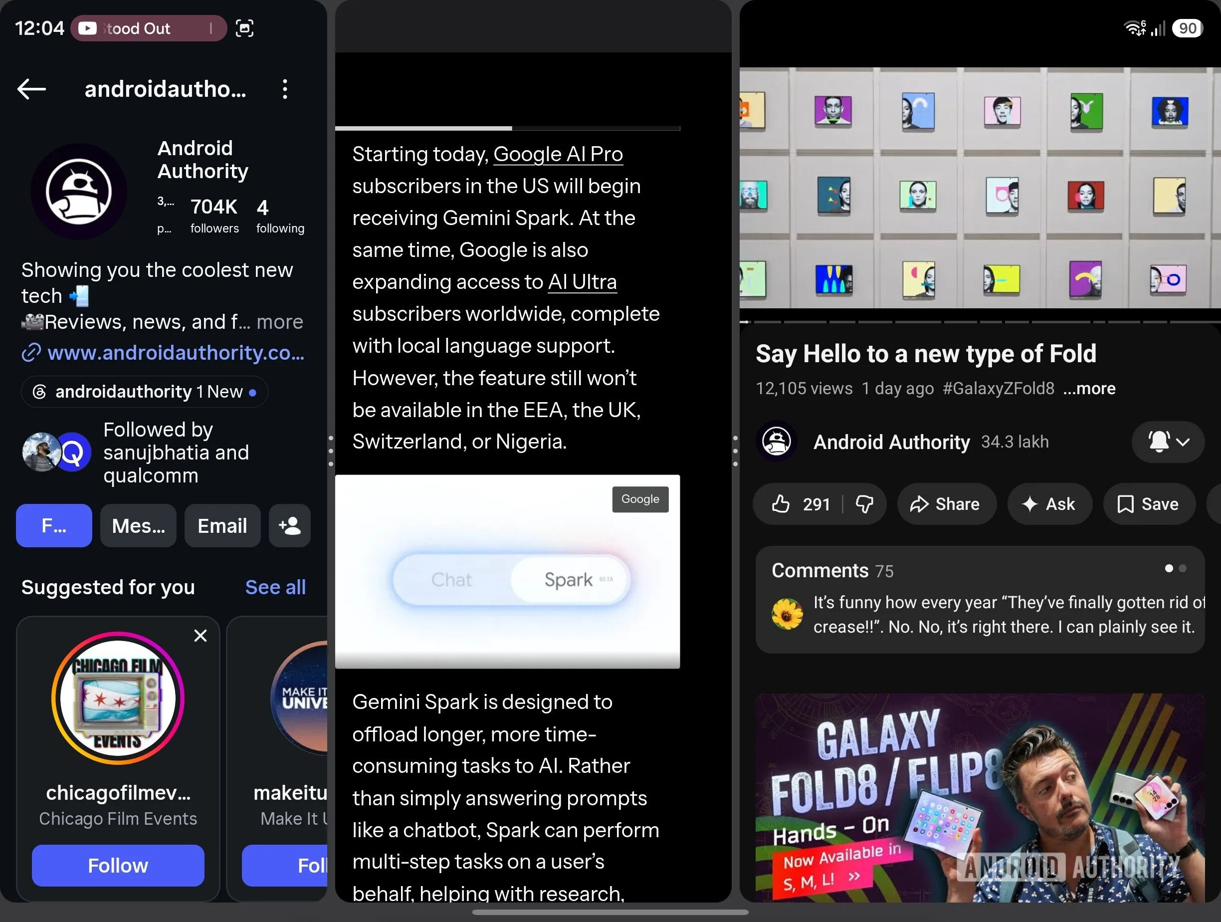
The new Galaxy Z Fold 8 layout looks like Samsung acknowledging that fewer, smarter presets can beat a sprawling menu of options. One large workspace plus two contextual side panes maps neatly to how people actually work: read while replying, compare while shopping, watch while taking notes, or keep an authenticator and email visible during an annoying login process. Nobody buys a foldable specifically to open a calculator beside a spreadsheet, but everybody appreciates it when the option is there.
Three panes only matter if they feel effortless
There are reasons to hold the applause for now. The screenshots and early reports establish that the layouts exist, not that they are consistently elegant. We still need to see how easily users can launch a three-app arrangement, change the primary window, save favorite combinations, move files between panes, and recover when one poorly optimized app refuses to cooperate. The difference between clever multitasking and daily multitasking is usually one extra gesture.
Samsung also has a habit of announcing software capabilities that vary depending on region, model, app version, and whether a particular feature is enabled by default. If these layouts remain exclusive to the Galaxy Z Fold 8 series, that would be a missed opportunity. One UI’s multitasking improvements often make sense on older Fold hardware too, and a software feature with this much utility would be a far better upgrade incentive than artificial scarcity.
My read is that Samsung is doing the sensible thing, even if it is arriving a little late. Foldables have spent years chasing the idea of a smaller, thinner tablet. The winning devices will feel less like shrunken tablets and more like pocketable workstations that understand what a second screen is for. If the Galaxy Z Fold 8 makes three apps feel natural instead of theatrical, Samsung may have found one of the first Fold upgrades people will actually use every day.