

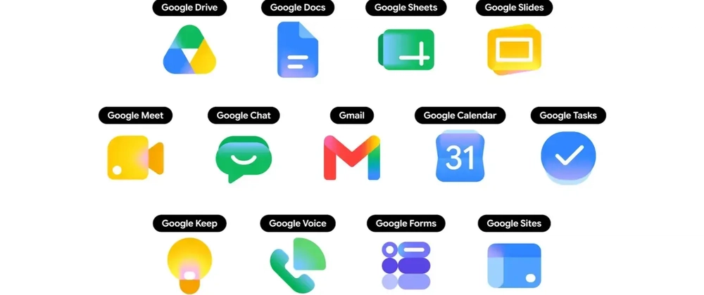
- Google Workspace icons for 13 apps got a gradient redesign on May 18 — and your dashboard probably still shows the old ones.
- The new Google Workspace icons drop the four-color rule, giving each app one or two dominant colors for better clarity at small sizes.
- Open-source library thesvg.org shipped all 13 updated icons the same week as Google’s web rollout — free, no attribution required.
- Gmail is the only app in the new set that keeps multi-color fills — treat it differently if you’re applying CSS color overrides.
Table of Contents
Google Workspace Icons Just Got Their Biggest Refresh in Years
On May 18, Google started rolling out redesigned Google Workspace icons across 13 of its core apps. Gmail, Drive, Docs, Sheets, Slides, Calendar, Chat, Meet, Vids, Forms, Keep, Voice, and Tasks all received new gradient artwork on the web, with iOS and Android following shortly after. If you’ve opened Chrome’s New Tab page or the app launcher on any Google property in the past week, you’ve already seen them — Google pushed the change silently, no settings toggle required.
That quiet rollout is exactly what makes this tricky for developers. Google didn’t send a press release to your inbox. There was no deprecation notice in Search Console. One day the Google Workspace icons looked one way; now they look different. And unless someone on your team happened to notice, your product is quietly showing users a set of icons that no longer matches what they see everywhere else Google lives.
What Actually Changed in the New Design
The old Google Workspace icons followed a rigid visual rule: every single product icon had to incorporate all four Google brand colors — blue, red, yellow, and green. The intention was brand cohesion. The result, in practice, was a wall of nearly identical-looking squares that forced users to read the label rather than recognize the shape. At 16 or 20 pixels, distinguishing Drive from Docs from Slides was genuinely harder than it needed to be.
The redesign ditches that rule. Each app now anchors to one or two dominant colors, paired with a softer gradient finish and a more prominent symbol. Google Meet leans into its video-camera shape with a cleaner green. Google Drive’s triangle is sharper and more saturated. The updated Google Workspace icons are also physically larger within their containing boxes — most no longer ship with a rounded-square background card, so the symbol itself fills the full visual space instead of floating inside a container.
Gmail is the one deliberate exception. It still carries multiple colors, because the envelope shape combined with the M-letterform and the red-and-white palette is Gmail’s brand identity. Stripping it to a single color would cost more in recognition than it would gain in consistency. That exception matters for developers, and we’ll get to why in a moment.
The broader direction here mirrors what we’ve seen from Microsoft’s Fluent icon refreshes and Apple’s gradual shift toward more expressive, less flat iconography. Flat design had its moment, but at high pixel densities and across varied backgrounds, a little gradient and depth actually aids legibility. Google is catching up to that reality.
Why the New Google Workspace Icons Aren’t Already in Your Bundle
Here’s the part that catches developers off guard every time a major platform does a brand refresh. The updated Google Workspace icons don’t just appear in your project automatically. Someone has to find the originals — usually by extracting them from a live site or digging through a brand media kit — then run them through an optimizer like SVGO, check that they render correctly on both light and dark backgrounds, and finally categorize, name, and ship them into whatever library or design system you’re using.
For a single icon from a single product, that process takes days. For thirteen apps in one simultaneous rollout, you’re looking at weeks — assuming the person doing the work has bandwidth at all. Most open-source icon libraries run on volunteer hours. There’s no SLA. There’s no on-call rotation for brand refreshes. The gap between Google pushing new artwork and that artwork landing in your npm install is a structural feature of how OSS icon ecosystems work, not a failure of any individual maintainer.
The practical consequence is visible to your users before it’s visible to you. Anyone who uses Gmail in one browser tab and your product in another is doing a subconscious comparison. Old icons read as a signal that a product hasn’t been touched recently — not because users consciously think about it, but because visual inconsistency registers as staleness. It’s a small detail. Small details accumulate.
Where to Get the Free SVGs Right Now
The open-source library thesvg.org shipped all 13 updated Google Workspace icons the same week as Google’s web rollout — which is unusually fast by the standards of the ecosystem. The icons are free, no attribution required, and the source is on GitHub at GLINCKER/thesvg if you want to contribute or file an issue.
The library itself is broader than just Google: it carries over 6,030 SVG icons spanning brand logos, AWS architecture diagrams, Azure service icons, and Google Cloud icons — all versioned and available via npm, CDN, CLI, or API. For teams managing integration pages, partner directories, or SaaS dashboards, having a single versioned source for brand icons is meaningfully better than the current status quo of hunting through press kits and random GitHub repos.
Install it with a single command:
npm install thesvg
Or download directly from the site. Icon URLs follow a stable pattern — /icons/[brand]/[variant].svg — which means you can wire them into a build step cleanly rather than treating them as runtime fetches.
The Gmail Edge Case You Need to Handle
If you’re migrating your existing Google Workspace icons imports to the 2026 variants, eleven of the twelve non-Gmail apps will behave exactly as you’d expect. They work cleanly with a currentColor fill or a single-color CSS override if your design system needs it. Gmail doesn’t. Because the multi-color fill is the brand, applying a currentColor override breaks the icon — you’ll flatten the M-envelope into a monochrome shape that’s no longer recognizably Gmail. Treat it as a special case in your render logic and leave the fills untouched.
For Vite or Next.js projects, importing the SVG as a component through your bundler’s SVG loader is cleaner than reading the file directly at runtime. Either approach works — just don’t make it a client-side fetch in production.
What This Means for Teams Shipping This Week
If you maintain a SaaS product with a Google integration, a “works with Workspace” marketing row, or any UI that surfaces Gmail, Drive, or Meet alongside your own product, updating your Google Workspace icons is a one-afternoon fix that’s worth prioritizing. The delta between showing old icons and new ones is small in effort. The delta in how current your product looks to users who live in Google’s ecosystem all day is larger than it sounds.
More broadly, this is a good moment to audit how your project handles third-party brand assets in general. Brand refreshes happen constantly — Slack, Zoom, Microsoft, Atlassian, and Figma have all touched their marks in the past two years. Teams that have no clear path from “a brand updated its logo” to “our app reflects that update” will keep hitting this problem. A versioned, maintained library like thesvg is one answer. A design system contract that treats third-party brand assets as first-class versioned dependencies is a better long-term one. Google just reminded you why that matters.