

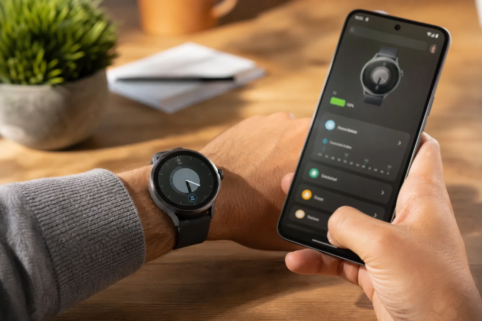
- Samsung has begun rolling out a redesigned Galaxy Wearable app before its expected Galaxy Watch hardware announcement at Unpacked.
- The Galaxy Wearable app now puts battery estimates, watch controls, and common settings on a more useful central Home screen.
- A new three-tab layout separates watch faces, daily device controls, and deeper settings without burying basic actions.
- Full watch previews could make Samsung’s expanded face browser feel less like a settings page and more like a storefront.
Table of Contents
Galaxy Wearable app puts the watch back at the center
Samsung’s Galaxy Wearable app has long done the job, in the same way a cluttered utility drawer does the job: you can find what you need eventually. Its newly rolling-out redesign looks like Samsung finally recognized that a companion app is part of the product experience, not merely the place you visit when Bluetooth misbehaves or a watch face needs changing.
Samsung has started pushing the refreshed app shortly before Galaxy Unpacked, where the company is expected to show the Galaxy Watch 9 and Galaxy Watch Ultra 2 alongside the next phase of its One UI Watch software. Rather than saving every visible change for the stage, Samsung is giving current watch owners a preview through the software already on their phones.
That is a small but smart move. Most people don’t experience a smartwatch solely on their wrist. They experience it while setting up alerts, managing apps, checking battery levels, and hunting for a face that doesn’t look like it belongs on a casino wall clock. The phone app is where much of that relationship lives.
A cleaner layout fixes a familiar Samsung problem
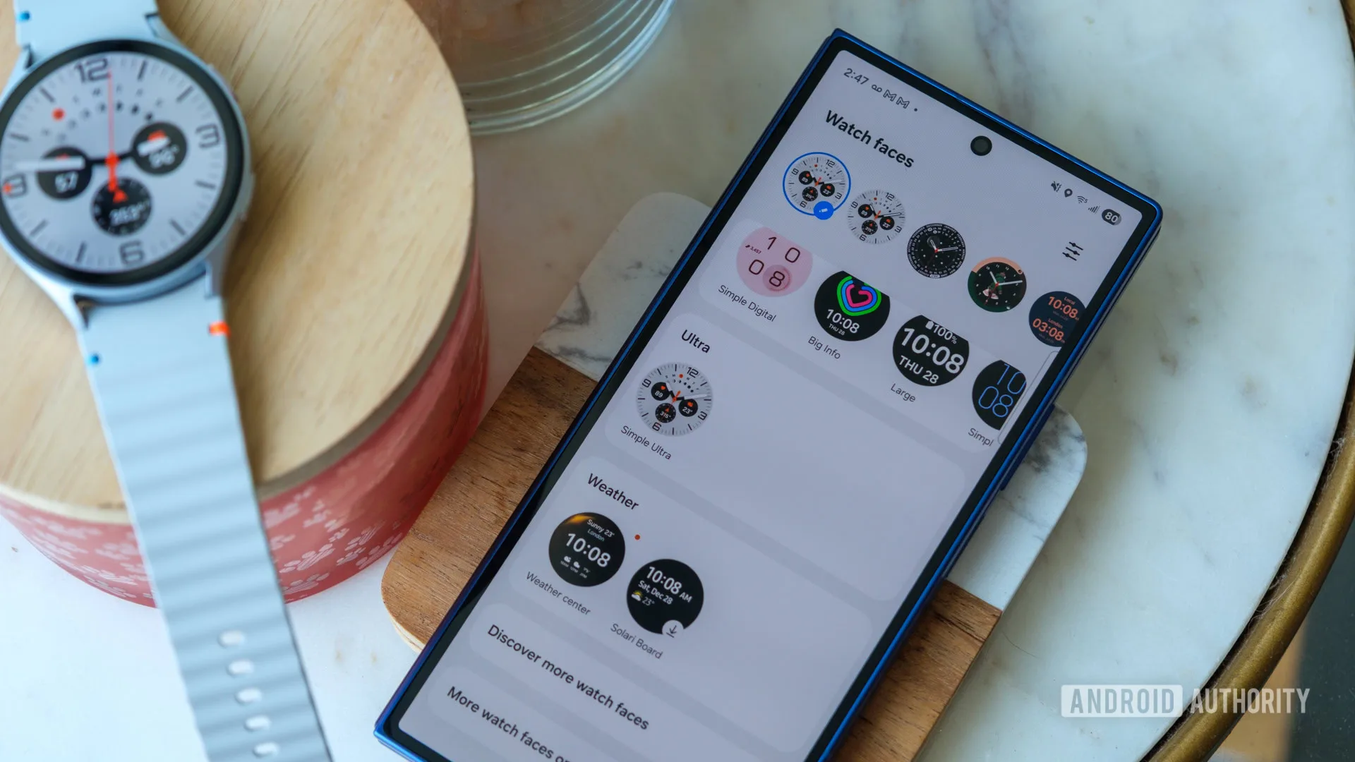
The old interface leaned heavily into black panels and dense lists. Functional, yes. Especially inviting, no. The updated Galaxy Wearable app adopts Samsung’s more recent One UI visual cues: softer gradients, rounded floating cards, and clearer groupings that make the screen feel less like a service menu from 2019.
Navigation now breaks into three primary tabs: Watch Faces, Home, and Settings. That sounds almost comically obvious, but it addresses a real issue. Customization and maintenance are different tasks, and the previous design made users work through too many layers to get between them. If you want to swap a face before leaving the house, you should not have to mentally parse a device-management dashboard first.
Samsung is hardly alone in learning this lesson. Apple’s Watch app has long treated the iPhone as a control center for complications, notifications, cellular settings, and app arrangements. Google’s Pixel Watch setup has pushed toward a simpler, health-first presentation. Samsung’s advantage is that it supports a sprawling watch lineup and an equally sprawling collection of settings. The danger, naturally, is turning that flexibility into clutter.
My read is that the revised Galaxy Wearable app makes a reasonable bet: surface the handful of controls people actually touch, then leave the complicated stuff in Settings where it belongs. Nobody opens a watch companion app hoping for an administrative experience.
The Home tab is the meaningful upgrade
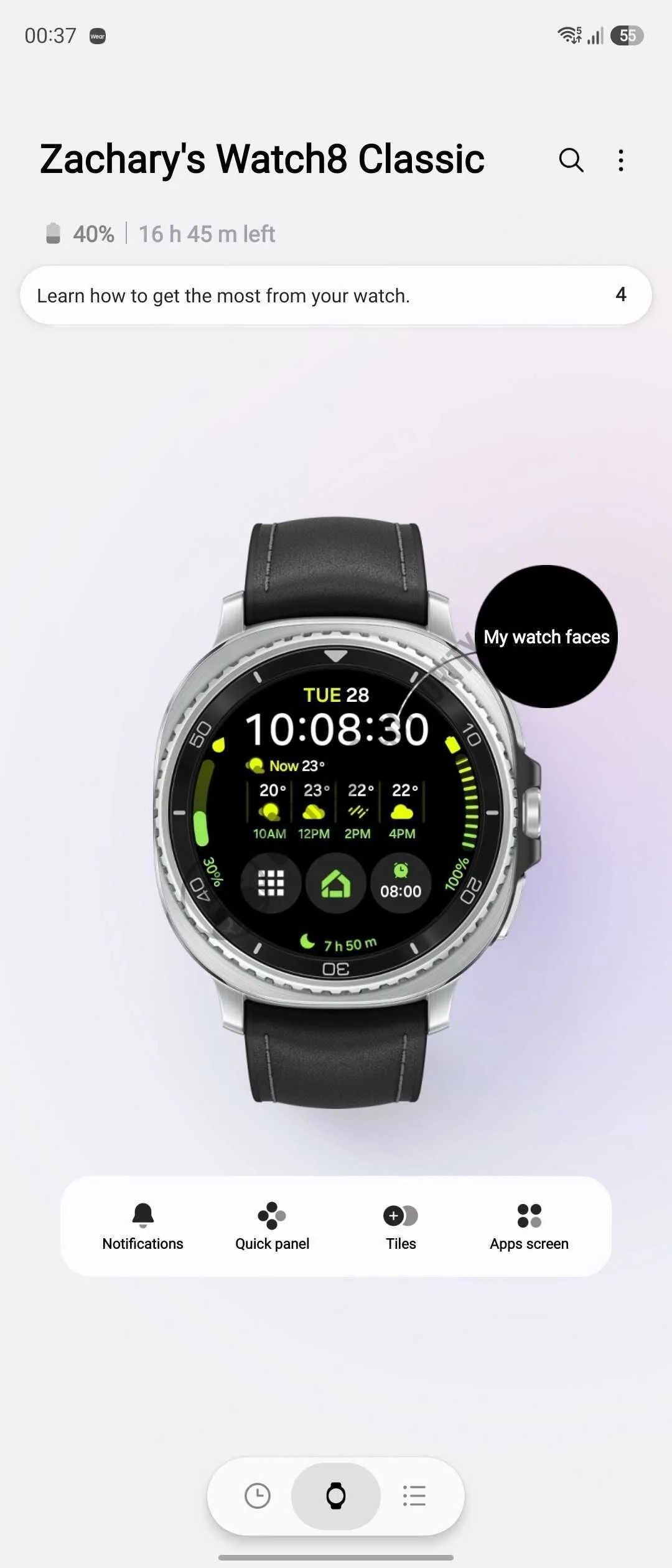
The centerpiece is a new Home tab that shows the connected watch, its battery percentage, and an estimate of remaining battery life. Below that, Samsung places shortcuts for frequent jobs, including notifications, Tiles, installed apps, and the quick panel.
This is the part that matters more than the gradients. Battery estimates are especially useful on a device that users commonly charge in short bursts before bed, before a workout, or while showering. A percentage tells you something; an estimated time tells you whether you can make it through tomorrow’s run and workday without packing a charger.
The revised Galaxy Wearable app also acknowledges a basic truth about watches: the most popular settings are repetitive. People change notification behavior after a noisy group chat gets out of hand. They reorganize Tiles when their habits shift. They disable an app after discovering it has become a tiny vibrating billboard on their wrist. Quick access turns those moments from chores into taps.
Samsung has not presented this as a feature-packed overhaul, and frankly it does not need to be one. For existing Galaxy Watch owners, fewer steps are the feature. It is the same reason smartphone manufacturers keep redesigning Control Center-style panels: the controls you use ten times a week deserve more care than the ones you touch twice a year.
Watch-face previews get closer to how people actually choose
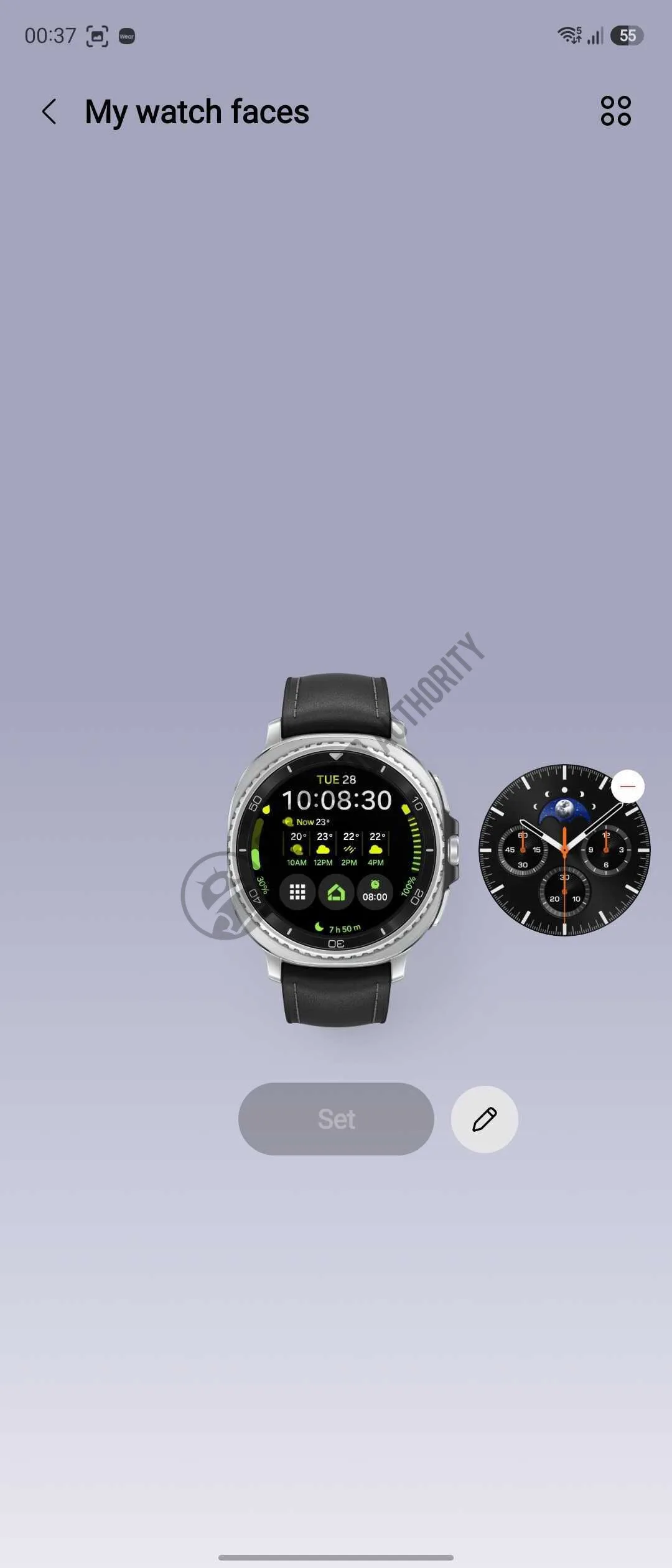
The other conspicuous change is the watch-face browser. Rather than relying on flat thumbnails, the new Galaxy Wearable app shows faces in a full watch preview. That should make it easier to judge complications, color choices, and the overall feel before applying anything.
It sounds cosmetic. It is not entirely cosmetic. Watch faces are one of the few areas where a smartwatch is genuinely personal, and Samsung has a large enough catalogue that browsing can feel like scrolling a streaming service with poor cover art. A realistic preview reduces guesswork, particularly for faces with edge-to-edge graphics or complications that behave differently than a static image suggests.
Better discovery also puts Samsung’s own faces in front of more users and gives people a reason to revisit the companion app instead of settling on one default look for two years. Apple has made face switching a core part of watch ownership, while Google is still building a recognizable visual identity around Wear OS. Samsung has the hardware scale to compete here; it just needed a less awkward showroom.
The update appears to be reaching users in stages, so not every Galaxy Watch owner may see it immediately. Samsung’s official Galaxy Wearable support page remains the practical starting point for checking app availability and device support. As usual with Samsung software releases, rollout timing can vary by phone, watch model, region, and app-store channel.
Samsung is treating companion software as product strategy
The redesigned Galaxy Wearable app arrives as smartwatches become less about novelty and more about daily reliability. The hardware improvements from year to year can be subtle: a slightly brighter display, a faster chip, a new sensor, perhaps a tougher case. What users feel every day is whether notifications are manageable, whether setup is painless, and whether the watch still has enough charge for sleep tracking.
This pre-Unpacked release is therefore a practical move, not just a cosmetic warm-up. Samsung is trying to make its ecosystem feel coherent before it asks buyers to consider new hardware. And it is a welcome contrast to the old industry habit of launching a glossy device, then making customers wait months for the software experience to catch up.
If the updated Galaxy Wearable app remains quick and stable after it reaches millions of phones, Samsung will have solved a quietly important problem. The next question is whether One UI 9 Watch can make the watch itself feel as thoughtfully organized as the screen now used to manage it.