

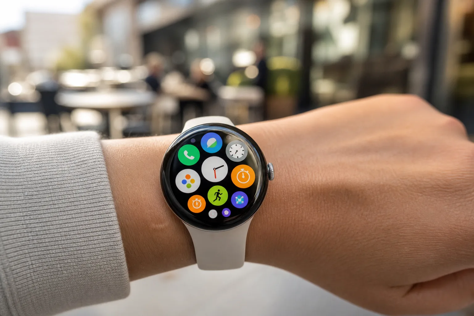
- Pixel Watch icons for Clock and Stopwatch are receiving quieter colors and cleaner shapes ahead of Google’s next smartwatch launch.
- The refreshed Pixel Watch icons follow an ECG redesign in June, suggesting Google is gradually standardizing its Wear OS visual language.
- Clock gets the more substantial makeover, with softened alarm bells and a familiar 10:10 hand position.
- Small icon changes matter on a watch because app grids are a primary interface, not an overlooked settings screen.
Table of Contents
Pixel Watch icons are getting less cartoonish
Google is giving its Pixel Watch icons a modest but meaningful cleanup, starting with Clock and Stopwatch. At first glance, this is the sort of update that barely deserves a pause: two tiny symbols in an app drawer get new colors. But on a smartwatch, where the display is small and the app grid is constantly in your face, icon design carries more weight than it does on a phone.
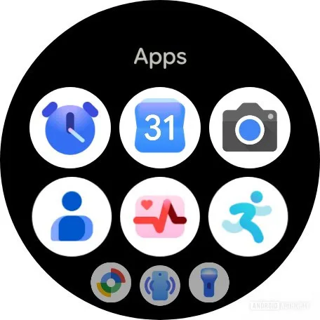
The revised Clock icon appears to be the bigger change. Google has toned down the old alarm-clock silhouette, reducing the visual emphasis on its bells and moving to a darker, more restrained palette. The hands now sit at 10:10, that long-standing watch-advertising pose that makes a dial look balanced rather than oddly vacant. It is a small bit of design convention, but there is a reason nearly every traditional watch maker uses it.
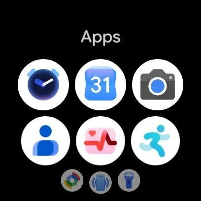
The old Clock treatment had a slightly playful, almost toy-like feel. That is not inherently wrong, especially for a consumer gadget, but it clashed a little with the Pixel Watch’s broader industrial design. Google’s hardware has generally tried to land somewhere between friendly and minimal. The updated Pixel Watch icons look more at home in that world.
Stopwatch is changing too, though less dramatically. Its core shape remains recognizable; the main shift is color. The newer version swaps the previous bright treatment for tones that feel more grounded and less like a leftover from an older Material Design experiment. Frankly, that is the right call. A stopwatch does not need to announce itself like a carnival sign when it is sitting beside fitness, health, and payments apps.
Why such a tiny Wear OS change actually matters
Smartwatch software lives under different constraints than Android software on a six-inch phone. On a Pixel Watch, people often interact with an app before they read its name. They raise a wrist, scan a small collection of circles, and tap quickly. Icons have to be distinct at a glance, legible in harsh daylight, and visually calm enough that the screen does not become a confetti cannon.
That makes the gradual refresh of Pixel Watch icons more than cosmetic housekeeping. Google has spent years improving Wear OS features, performance, and health tracking, but visual consistency has been a recurring weak spot. Some system apps have looked crisp and current, while others seemed to belong to a different design team working from an older brief. Anyone who has bounced between the Fitbit experience, Google Wallet, Settings, and the app launcher has probably felt that mismatch.
Apple has historically been more disciplined here. WatchOS app symbols can be colorful and expressive, but they generally share a consistent visual density when placed in the honeycomb app view. Samsung’s Galaxy Watch software has its own identity as well, although One UI Watch can sometimes tip into visual busyness. Google is clearly aiming for a middle ground: approachable enough for a casual user, but less whimsical than its earlier icon work.
The timing is hard to ignore. Google is expected to introduce the Pixel Watch 5 alongside the Pixel 11 series, with Wear OS 7 part of the wider package. Updating Pixel Watch icons before the hardware arrives is a sensible way to make the next watch feel polished from day one without pretending that new paint is a headline feature.
There is another practical point. App icons are among the few parts of a platform that remain visible regardless of how someone uses the device. You may never open ECG. You might ignore Stopwatch entirely. Yet their symbols still sit in the launcher, helping form a first impression of the software. Think of it like a tidy kitchen counter: it does not change what dinner tastes like, but it does affect whether the whole place feels cared for.
A pattern that began with the ECG app
Clock and Stopwatch are not Google’s first recent targets. The company updated the ECG app icon in June, and this latest set of changes makes that look less like a one-off adjustment. My read is that Google is conducting a slow, app-by-app pass across its wearable software rather than unveiling one grand icon system all at once.
That rollout has a practical upside: Google can see whether the new symbols remain recognizable to existing users without turning an ordinary software update into a confusing scavenger hunt. The downside is that the transition can look patchy for a while. If only a handful of Pixel Watch icons adopt the newer, darker style this summer, the launcher may briefly become even more visually mixed before it becomes coherent.
Still, gradual beats stagnant. Google has a particular habit of treating visual systems as living things, sometimes to an exhausting degree. Android users have watched Material You colors spread through apps at wildly different speeds, while Google’s branding shifts have occasionally made products feel disconnected from one another. Remember when every Google service seemed to acquire a four-color motif whether it wanted one or not? The company’s best design work happens when it edits rather than adds.
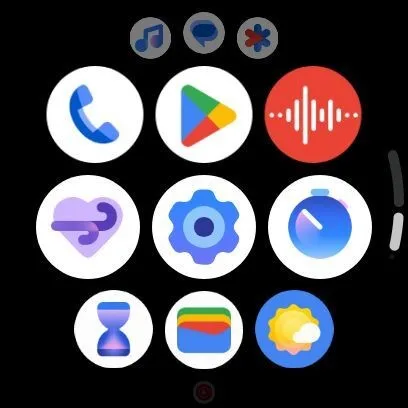
For the Pixel Watch, editing is exactly what is needed. The hardware itself has matured into a recognizable rounded form, and the software should now stop looking like a collection of experiments. Wear OS is built around glanceable information and quick actions. Cleaner visual cues support that promise better than decorative flourishes ever will.
The Pixel Watch 5 will need more than nicer symbols
None of this means a redesigned Clock icon will persuade someone to buy a Pixel Watch 5. Battery life, health features, charging speed, durability, and the inevitable comparison with Apple Watch and Galaxy Watch will matter far more. If Wear OS 7 brings useful improvements, those will be the story. Icons are the trim, not the engine.
But trim has a way of revealing whether a company is paying attention. Google is trying to make its watch feel like a finished product ecosystem rather than a hardware shell running a patchwork of Google, Fitbit, and legacy Wear OS ideas. The newer Pixel Watch icons point in the right direction: less visual noise, more confidence, and an interface that seems designed for a wrist rather than shrunk down from a phone.
We will see how far Google carries the cleanup after the Pixel Watch 5 arrives. The interesting question is not whether Clock looks better. It does. The question is whether Google finally applies that same discipline to every corner of Wear OS where users have learned to expect a little inconsistency.